· 4 min read
Data Visualization with ChatGPT
The Adventure Begins
I tried to tackle a makeover from the well known MakeoverMonday series with ChatGPT. This weekly series looks at data visuzliations and suggests ways to improve them. I took the data from the 23rd week of 2023. This weeks’s data was about how advances in agritech have allowed for an increase in cereal production over the years. The data is available on Data World.
While the MakeoverMonday series focuses heavily on using Tableau, I wanted to see if I could use ChatGPT to create a data visualization.
I looked at the famous Noteable plugin first. However, I wanted a more transparent approach, where I could see how ChatGPT tackles such problems, and what kind of challenges I would face.
I decided to create a Streamlit app, which is almost like a Python notebook that can be easily hosted as an app. The app is available here. The code is available on Github.
Here are the broad steps I followed:
- Downloaded the data from Data World and saved it as a CSV file.
- Started a chat session on ChatGPT, you can follow through the whole chat [here]. (https://chat.openai.com/share/0571e4da-782f-41b1-a0bb-178651a43f79)
- Setup a python virtual environment in Visual Studio Code so that my expirments with ChatGPT don’t interfere with my other projects.
- Added the required packages to the virtual environment by creating a requirements.txt file.
- I was able to get the following output from ChatGPT by giving it a description of the what I wanted and the first few rows of the data.
import streamlit as st

import streamlit as st

import streamlit as st
import pandas as pd
import matplotlib.pyplot as plt

# Load the data fropythonCSV file
data = pd.read_csv('cereal_production_data.csv')

# Set page title and layout using Tailwind CSS
st.set_page_config(page_title='Cereal Production Dashboard', layout='wide')

# Set the title and description of the dashboard
st.title('Cereal Production Dashboard')
st.markdown('This dashboard visualizes cereal production data.')

# Create a sidebar for selecting the country
selected_country = st.sidebar.selectbox('Select Country', data['Entity'].unique())

# Filter the data based on the selected country
filtered_data = data[data['Entity'] == selected_country]

# Line chart with years on the x-axis and different lines for each metric
fig, ax = plt.subplots(figsize=(10, 6))

ax.plot(filtered_data['Year'], filtered_data['Area harvested (hectares)'], label='Area harvested')
ax.plot(filtered_data['Year'], filtered_data['Production (tonnes)'], label='Production')
ax.plot(filtered_data['Year'], filtered_data['Yield (tonnes per hectare)'], label='Yield')
ax.plot(filtered_data['Year'], filtered_data['Population (historical estimates)'], label='Population')

ax.set_xlabel('Year')
ax.set_ylabel('Value')
ax.set_title(f'Data for {selected_country}')
ax.legend()

# Display the chart using Streamlit's native `pyplot` command
st.pyplot(fig)

# Show the data table
st.subheader('Data Table')
st.dataframe(filtered_data)

# Show the description of the columns
st.subheader('Column Descriptions')
st.markdown("""
- Area harvested (hectares): The total area of land used for cereal production in hectares.
- Production (tonnes): The total production of cereals in tonnes.
- Yield (tonnes per hectare): The average yield of cereals per hectare.
- Population (historical estimates): Historical population estimates.
""")
This was a great start.
The first enhancement I needed to do was to make the data show relative growth from the first year. ChatGPT was able to do this quite well
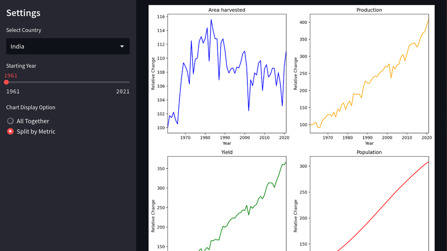
In the Makeovermonday webcast, Andy Kriebel goes on to show how he added the capability to switch from a single chart to individual charts for different metrics. It takes him a while to get that done using the various advanced Tableau capabilities. I thought this wouldn’t be so easy for ChatGPT either. However, I was pleasantly surprised that ChatGPT was able to do this quite easily making use of the capabilities of matplotlib.
Getting ChatGPT to retain the colors from the single graph, and laying out the graph in a 2X2 grid required a few tries, but it was able to get it right fairly quickly.
The next step was to add a feature to allow the user to change the starting year. This proved to be much harded some how. ChatGPT stumbled many times to get this right. I had to try several times, with different prompts to get the right output. But eventually it did manage to get it right.
Finally, I wanted to set the default value of the dropdown to a particular value representing the “World”. I believe ChatGPT was really tired by this time, rather I think it didn’t know the Streamlit API well enough to it took a bunch of retries to make it work.
Conclusion
What I learned from this adventure was that while ChatGPT can get you off to a good start, and can assist in writing code even if you don’t know the language, libraries, or the frameworks well enough, very soon you start running into problems. When that starts happening, it becomes hard to understand where the problem lies. Is it ChatGPT hallucinating things, or did I make a mistake in the code, or is it a limitation or an incorrect version of the framework or library.
Hoping things will improve from here on and soon specialized tools that marry the power of GPT with those provided by the frameworks and libraries will be available.